Flownex Friday Tech Tips #4
Compound components make it easy and efficient to reuse the same collection of components over and over throughout your models. In this post I’ll be going over the basics of making a user-friendly and aesthetically pleasing compound component. In this example I am working in Flownex Version 8.12.7.4334
How to create a compound component
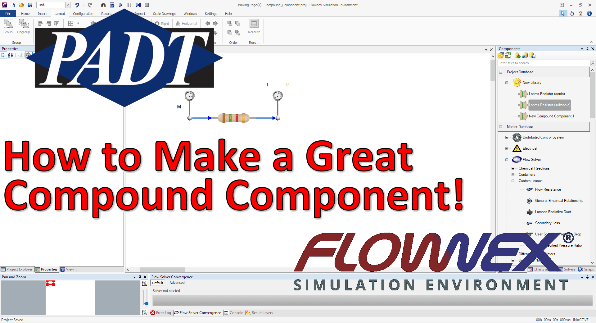
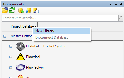
To create a compound component we must first create a local library in the project database. This can be done by right-clicking on the project database in the components pane and select “New Library”.
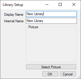
We can name our new library and choose a picture if desired:
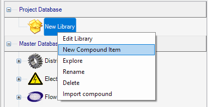
To create our compound component we just need to right-click on the new library and select “New Compound Item”
To build our compound component we’ll use the “edit” function on the compound component. In this example I am building a Lohm resistor component. It’s a good idea to test my component on a separate page to make sure scripts interact as expected and validate results against some given test cases.

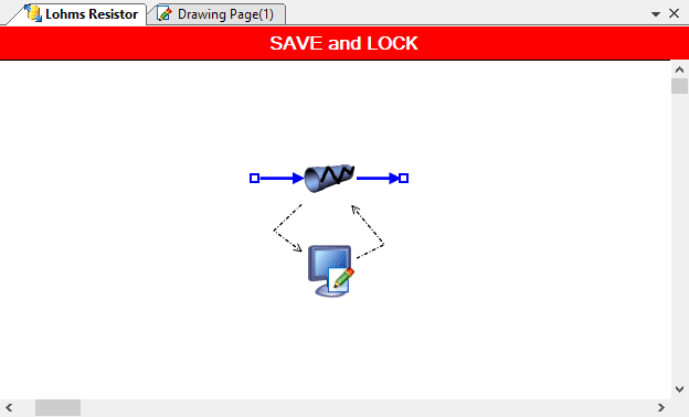
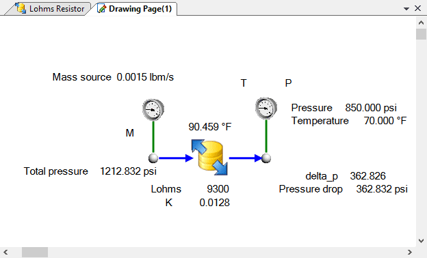
Let’s make it functional!
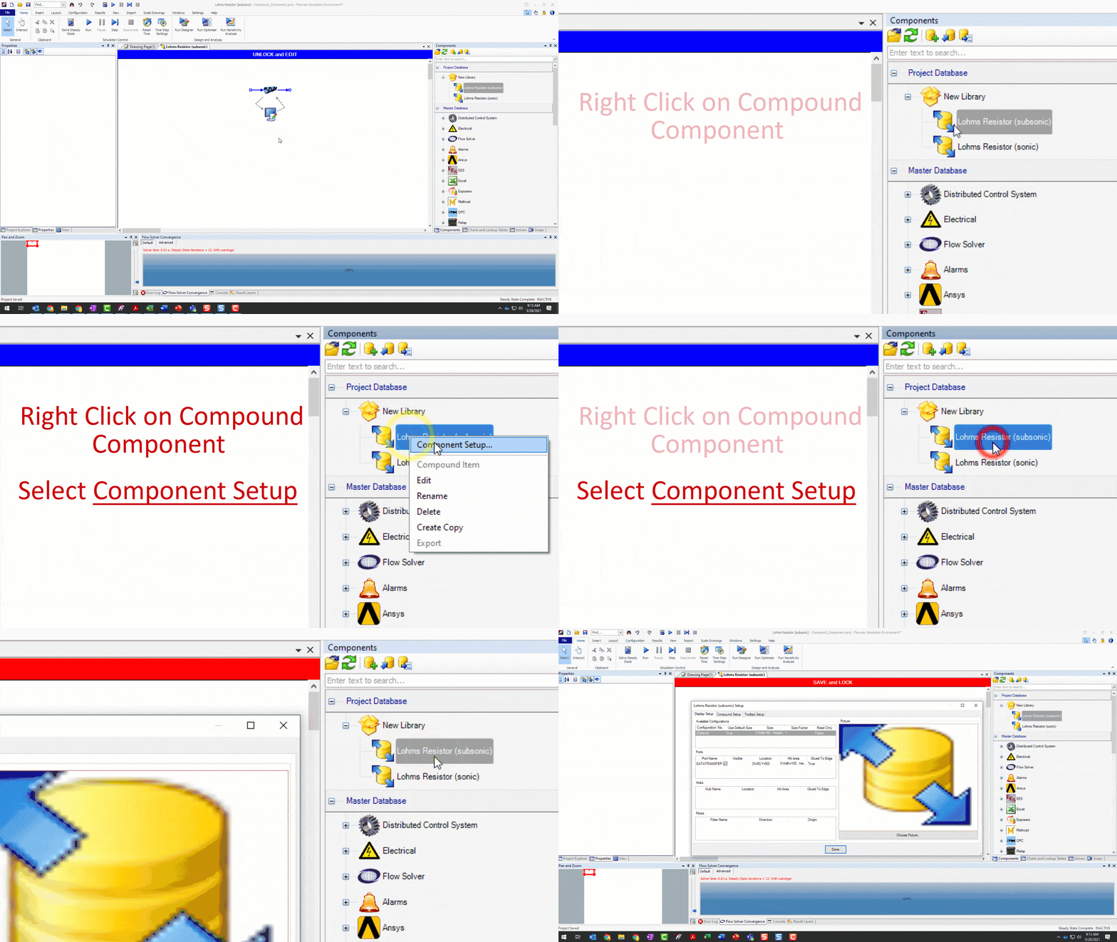
To define the inputs and results we’d like to expose to the user we right-click on the new compound component in the library and select “component setup”.
To add inputs and results we need to navigate to the Compound Setup ribbon and then simply drag and drop inputs and results into the Selected Properties window. Note that we can even grab whole categories of inputs or results to save time!
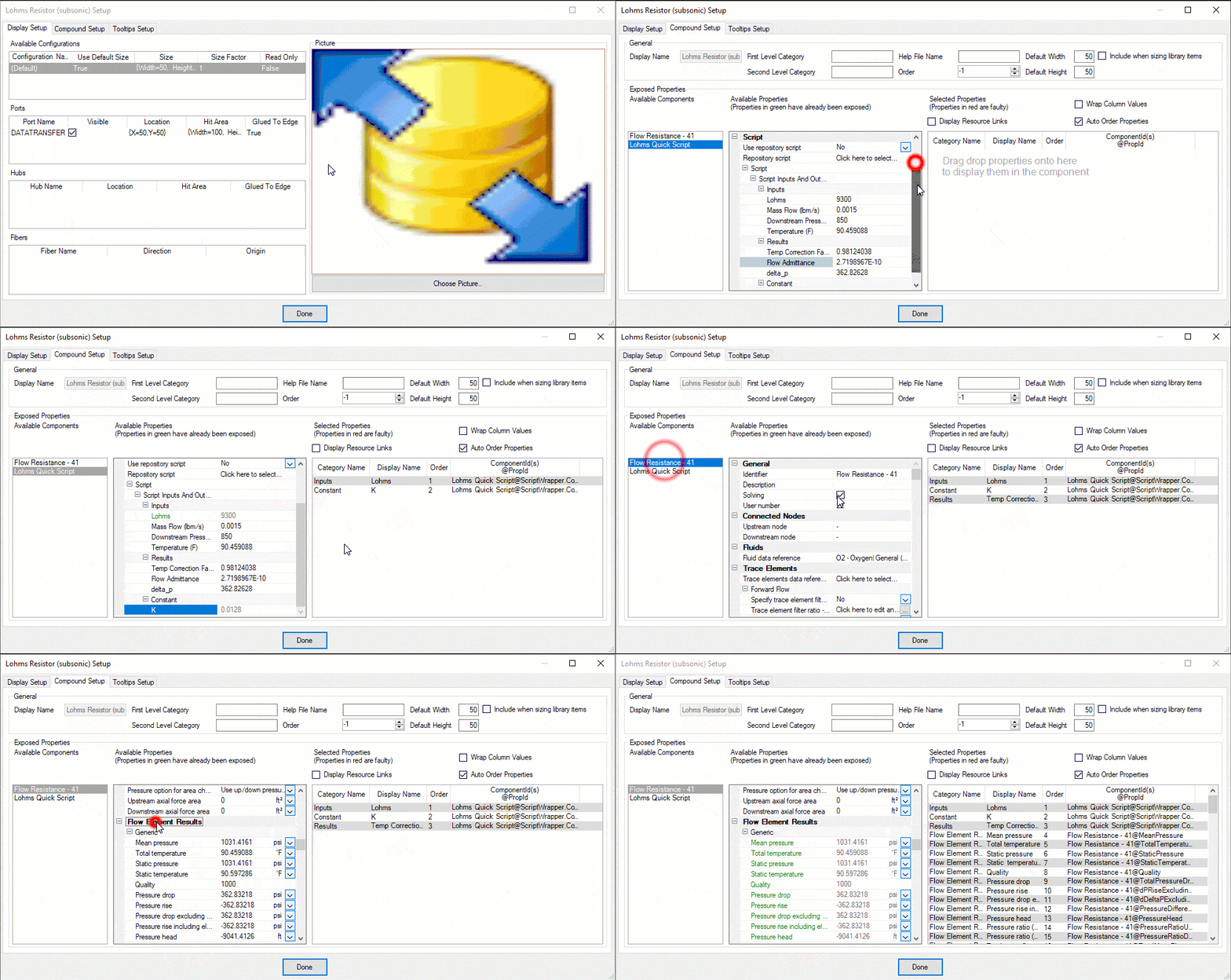
Now those inputs and results will appear to the user when they add this compound component to their canvas!
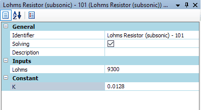
Let’s make it pretty!
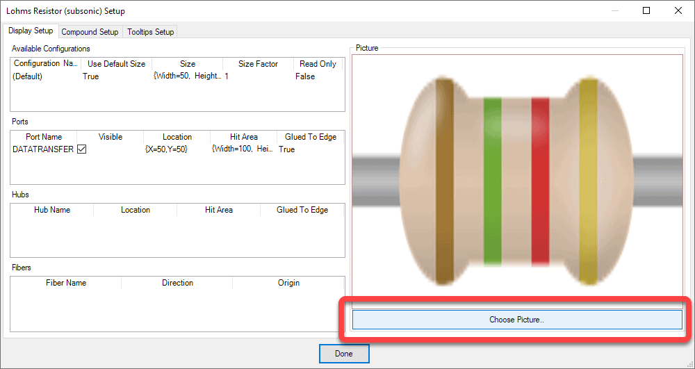
To make our component more aesthetically appealing let’s replace the boring default icon with one more representative of our Lohm Resistor. To do this we right-click on our compound component again and this time stay in the “Display Setup” tab. We can click the “Choose Picture” button to upload our own icon. To refresh on the image selector check out the blog post on adding a background image.
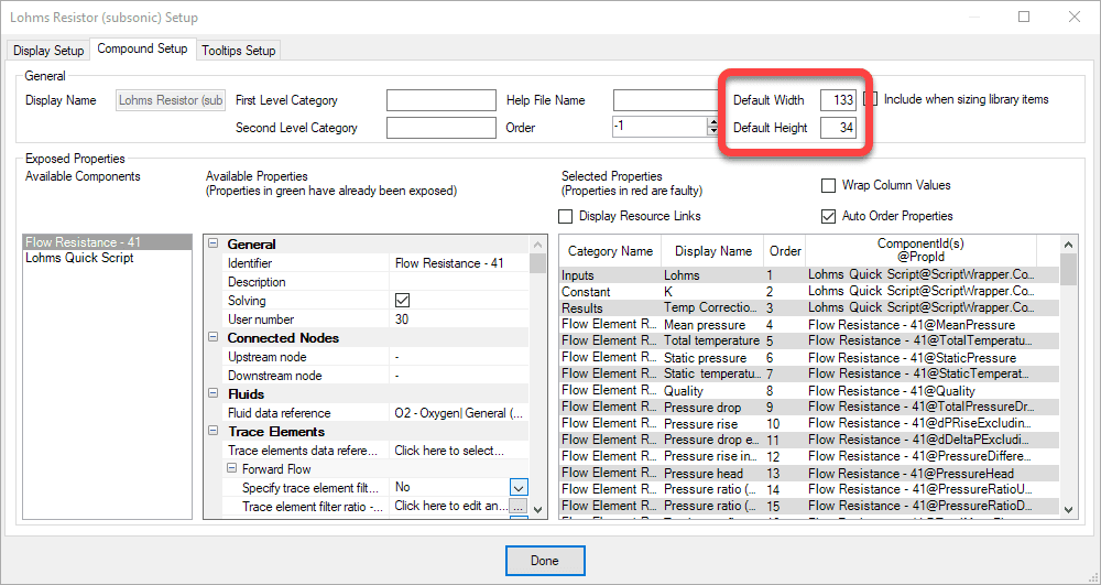
To correct the aspect ratio so that it shows up looking less squished on our canvas we want to change the settings back in the Compound Setup tab. I’ll change it to 133×34 so that it appears similar in scale to the standard flow components but correct in the aspect ratio.
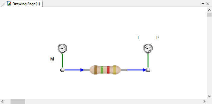
Now when we place our compound component onto our canvas it should look great!
Bonus Tips!
- In the compound component setup there is a third ribbon called “Tooltips Setup”. This is where we can define what properties show up when we hover our mouse over the component.
- Don’t forget we can save compound components in a “database” on a server so that they can be accessed by every Flownex user in your organization.

